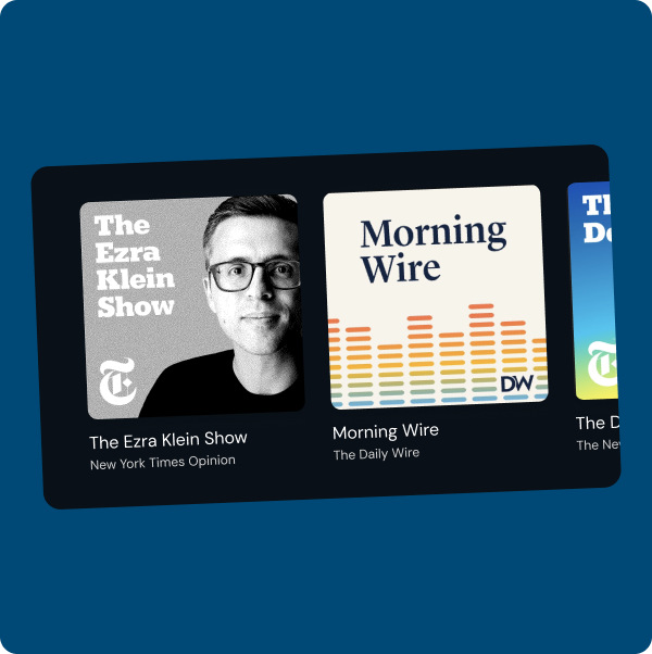
Enhancing Content Discovery
Improving the content discovery by adding consistent navigation and simplifying the homepage, making it easier for users to explore and engage with podcasts.
While working on DeepCast, we noticed it was hard for users to find features like bookmarks, lists, and saved content, especially on mobile. These features are key to helping users stay engaged, but they were tucked away in places that didn’t feel obvious. We wanted to rethink how content discovery works by making it easier for people to find and interact with their content without getting lost or confused by too many navigation elements. During this process, we also started thinking ahead about how these improvements could translate into a more seamless experience for a native mobile app in the future.
For this project, I designed both desktop and mobile MVPs to improve how users discover and interact with content on DeepCast. I did a deep dive into competitor navigation patterns to see what worked well elsewhere, and met weekly with the team to share updates, gather feedback, and make sure we were aligned on goals. The result was a cleaner, more intuitive navigation experience that better supports user engagement and sets the stage for future growth.
I THEN ASKED MYSELF...
How can I make it easier for users to discover content they actually care about without overwhelming them?
01
THE PROBLEM
Users were having a hard time discovering content that matched their interests. The navigation made it unclear where to find their saved content like bookmarks and lists. Without a more intuitive system, users were either missing key features or dropping off. We needed to rethink how content discovery and user-generated content were brought up.
Additionally, we wanted to increase engagement with these features and ensure users became familiar with them early on, helping to create more "stickiness" and build long-term retention.

02
GOALS
We wanted to make sure that users could easily access, create, and manage their own content like bookmarks, lists, and digests without getting lost in confusing menus. By highlighting these tools clearly and accessibly, we could improve usability and engagement.
By making user-generated features more visible and intuitive, we aimed to help users build habits around using them. This not only boosts engagement but also creates a stronger sense of investment in the platform, leading to longer retention and “stickiness.”
Many users access DeepCast from mobile devices, so the experience had to be just as seamless on smaller screens. A consistent and accessible navigation system across both desktop and mobile was important to prevent frustration and drop-off.

03
THE RESEARCH PROCESS
To validate where we housed our user-generated content, I conducted a competitive analysis of 7 different platforms. I focused on where each product places its user content, the pros and cons of those placements, and captured screenshots of their navigation UIs. This helped us better understand common patterns, what worked well, and what to avoid in our own design.
1. PLACEMENT PATTERNS 🧩
Across the seven competitors we analyzed, we noticed clear patterns in how user-based features were organized. A majority, four out of seven, placed these features under a top right profile dropdown. Two competitors used direct links like “My List” or “Account and List” for easier access. Five out of seven incorporated a sidebar navigation to surface user-based content, and interestingly, five also used a hybrid approach that combined multiple navigation methods to ensure accessibility and visibility throughout the experience.
2. MENTAL MODELS 🧠
Users are already conditioned to look in certain places for personal features like the top right profile icon or a labeled “My List” link. Leaning into these familiar patterns reduces confusion and helps users feel confident navigating the platform without needing to relearn anything.
3. ENCOURAGING ENGAGEMENT 👏
When user generated features are clearly visible, such as in a sidebar or homepage link, they become part of the user’s routine. This visibility increases the chance users will interact with and return to their saved content, which supports business goals around stickiness and retention.
WHAT DOES THIS MEAN?
Most competitors use a hybrid approach to make UGC features more accessible, combining methods like sidebars, top-right profiles, and links. This improves the experience across devices and increases the chances users will discover and engage with features.
05
IDEATION
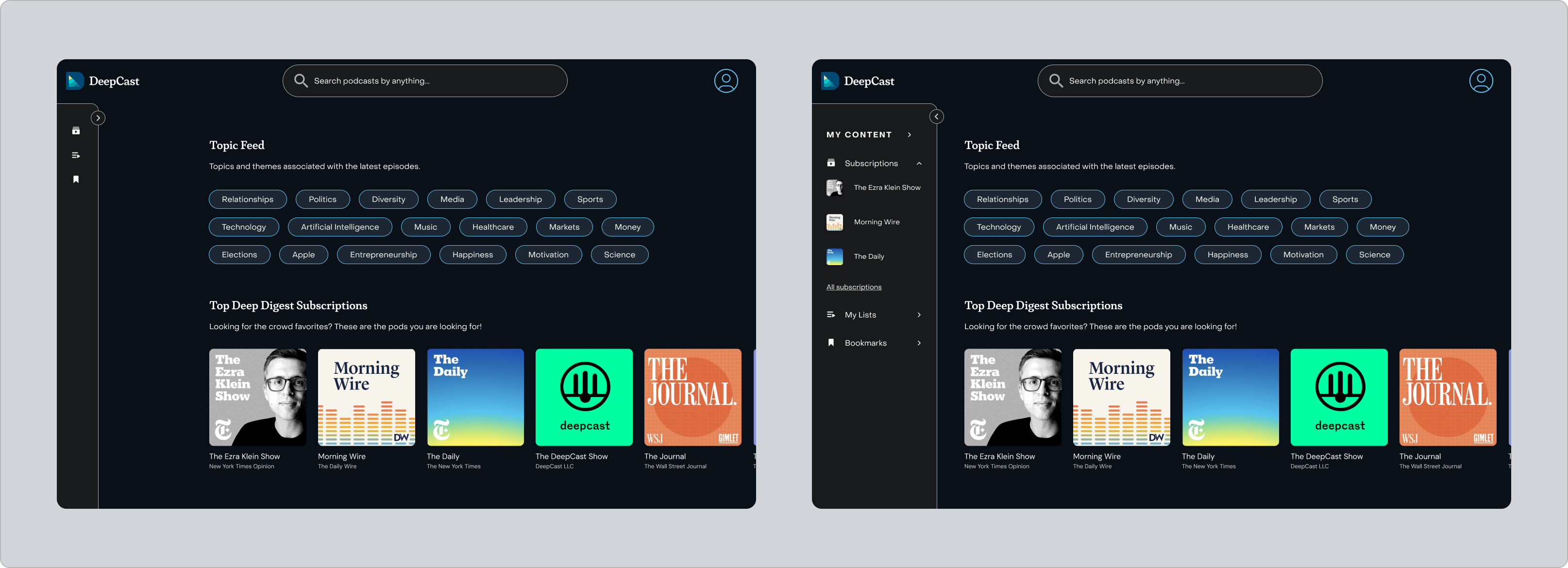
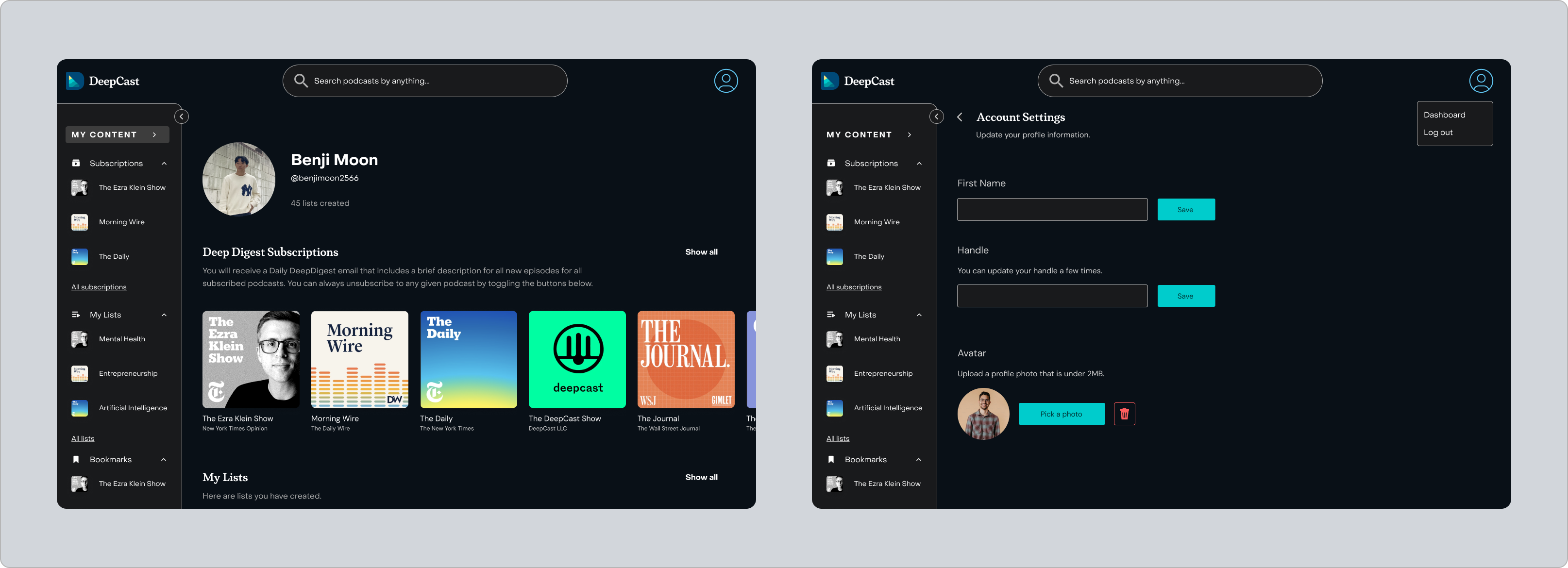
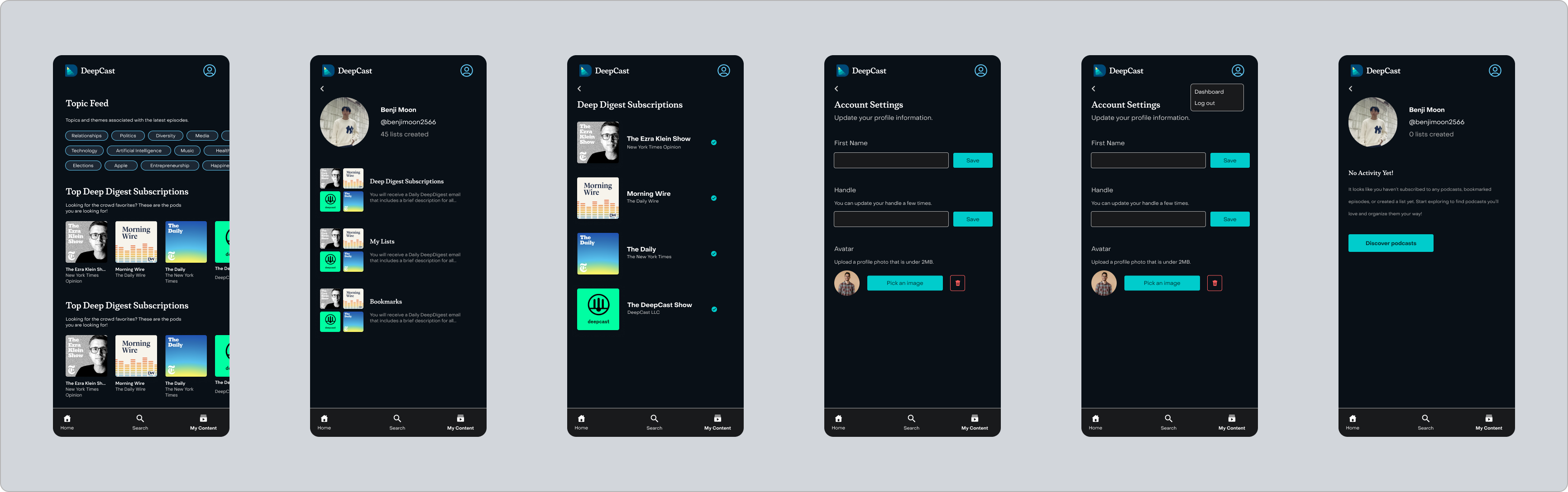
The main goal was to redesign the nav bar to bring more focus to user-generated content like lists, bookmarks, and digests. Since we were introducing a whole new navigation system, I also started thinking about how the homepage could better support content discovery without feeling overwhelming. For mobile, even though DeepCast is currently a web app, I knew the team eventually wanted to move toward a native app, so I took the initiative to design a native-style bottom nav that could work well now and also set us up for that transition down the line.
I met weekly with the product and engineering team to share updates and get feedback on my designs. We were working on a tight timeline, so I made sure to stay focused and iterate quickly based on what we discussed in those meetings.
06
FINAL DESIGNS
For this project, I focused on making it easier for users to find and engage with their saved content on DeepCast. I designed a new nav system for both desktop and mobile that surfaces things like bookmarks, lists, and subscriptions in a more intuitive way. Along the way, I did a deep dive into competitor navs, met weekly with the team to share progress, and thought ahead about how this could translate into a native mobile experience down the line.
I designed a high fidelity and interactive prototype MVP for both mobile and desktop, made up of seven key screens. The goal was to create a more intuitive way for users to find and engage with their saved content on DeepCast like bookmarks, curated lists, and podcast subscriptions. The updated navigation system is meant to make those features feel way more accessible and familiar, which not only improves the overall user experience but also encourages more interaction and deeper engagement across the platform.
07
REFLECTION & LEARNINGS
Through this project, I learned a lot about the importance of feature placement and how much user familiarity plays a role in navigation design. Researching competitor patterns showed me how even small decisions around where features live can make a big difference in how users engage with a product. This is something I’ll carry with me and apply to future designs to ensure that features are both easy to find and feel intuitive to use.